The Look & Feel of Your Brand?
You should so far have made a number of major decisions about your brand identity, and you are eager to hit the ground running at this stage. But while you should now have your name and logo registered, you must shift your attention toward developing the broader visual language of your brand and establish an identity system to help bring it to life in the eyes of your customers and the general public.
If you worked with a professional designer to create your logo, chances are, he or she will have covered many aspects relating to the overall style and visual aesthetic of your brand. If on the other hand, you decided to go it alone, there are several things that you still need to do to complete the development of your overall brand identity. The resources and tips in this article are for you. They are intended to help you settle into a design aesthetic and establish the perfect look and feel for your brand.
WHY A BRAND VISUAL STYLE?
The development of a brand identity doesn’t end with the creation of a logo. A visual context for the new brand is needed to support the development and implementation of your brand’s communication program.
Think for a moment of all the places and ways in which your audience will come into contact with your brand. Applying a consistent visual style to all these touchpoints will be critical. Your visual style will define your brand’s overall look and feel as well as its individual tone and manner.
“A complete brand identity program encompasses
an individual visual language that will express itself
across all application and brand touchpoints.”
Key Considerations
Your brand visual style is composed primarily of the following elements: A distinctive colour palette, a well-defined and consistent use of fonts and typographic styles, and readily identifiable visual assets as well as a definite approach to the selection, creation or visual treatment of future imagery.
Your new brand will have various touchpoints where it will be experienced by your target audience and your clients alike. Therefore, it will be important to convey the brand personality, point-of-view and look and feel in a consistent way across all media and touchpoints. To do so, you will need to create a unified/consistent visual language, while also establishing certain rules to ensure there is a balance between consistency and flexibility, so that these rules may not restrict creativity, but rather enhance it within the set boundaries of the brand aesthetic.
Making Colour Choices – The colours you pick for your brand will go beyond the colour(s) of your logo. A family of colours needs to work for all communications functions across analog and digital channels. You may choose to adhere to well established theories relating to the psychology of colours, and their meaning across various cultures, or to go with your gut and instinct trusting instead what may appeal to your audience. Remember that people tend to react to colour instinctively and that it often plays a key role in their purchasing decisions. Many brand systems often have two colour palettes: a principal and a secondary.
Choosing and Combining Fonts – Typography is one of the core building blocks of your brand. Most brands have one or maybe two typefaces (or font families) that are used consistently across all platforms. Neither of these are necessarily the font used in your logotype. The difficulty may come from making a selection of fonts from among the thousands upon thousands of choices available. We offer some principles to make the process simpler, below.
Choosing and Creating Visual Assets and Imagery – Beyond a desired look and feel, you will need to identify your marketing and content needs to help determine the type and the nature of the visual assets and imagery you will require. Will it be predominantly illustrations, photography, abstract patterns or graphics? If it is photography or illustration, what stylistic choices will you make in those areas that will come to define your unique and recognizable brand style?
These elements will come together in various combinations to create the overall brand aesthetic and look and feel. It is what makes a brand system proprietary and immediately recognizable. The combination and composition of these elements (colours, typography and visual assets) and their consistent use across all touchpoints, platforms and channels, together with your logo, should help define your visual language and the unique look and the feel of your brand visual style.
BEFORE YOU START
Get Inspired
I suggest you do a bit of research to get some perspective on what will be needed. You will need to ask yourself: What kind of personality do I want my brand to communicate? …and, What kind of mood or feeling do I want to evoke or have people feel when they come in contact with my brand? From there, you can start looking at how others may have responded when they asked similar questions. This is important for two reasons: 1) to gain some inspiration and to help define your own ideas, and 2) to ensure that what you create is a brand look and feel that is unique, one that will not be confused with someone else’s brand.
“You should be able to cover up the logo
and still identify the company because
the look and feel is so distinctive.”
Michael Beirut – Principal, Pentagram
Your visual style should be aesthetically unique enough to identify your company without causing someone to think of another brand, especially if they’re in the same space as you. Injecting your own personality into your design can help you create something unique.
Pinterest is a great way to have a look at many brands and how they have defined their own aesthetics, in everything from the colours they chose to the fonts they selected and the type of imagery and graphics they created, etc. https://www.pinterest.com
I further suggest that you pay a visit to your competition, to see how they present themselves graphically. Pick up their materials, go to their website, follow their social media profiles and the channels on which they are active. You will pick up many clues as to what decisions they have made, either deliberately or by default, as relates to their brand style.
WHERE TO BEGIN
Before you try to determine specific style elements, I recommend you make a list of the main communications components you will need, and then begin to design a few key items from this list. As you evolve these prototypical designs, you will acquire a better appreciation for the various style elements you will require, and the choices that you will make will be made within the context of a concrete applications, rather than in the abstract.
Selecting Your Brand Colours
A knowledge of basic colour theory and psychology may be of some use here, but I do not personally subscribe to a rigid way of thinking as relates to selecting brand colours, as I believe one’s goal should be differentiation and the avoidance of conformity.
You should aim to select a small palette of colours (five to ten overall) and to use them consistently to represent your company. Standard practice is to have a principal palette (“principal” to not be confused with “primary” colours) and a secondary (or support) colour palette. While not a fixed rule, your principal colour(s) should ideally be found in your logo itself.
You can extend your secondary colour palette by introducing shades and tints of these, going from full strength to lighter and darker shades, to help preserve a sense of visual cohesion.
The resulting palettes should be used in every aspect of your brand communication such as in your website, social media channels, and print and digital ads, as well as your physical premises, if you have a brick-and-mortar location. Additionally, they should be used on items such as uniforms, product packaging and signage, if these apply to your situation. The following tools can help you make some choices:
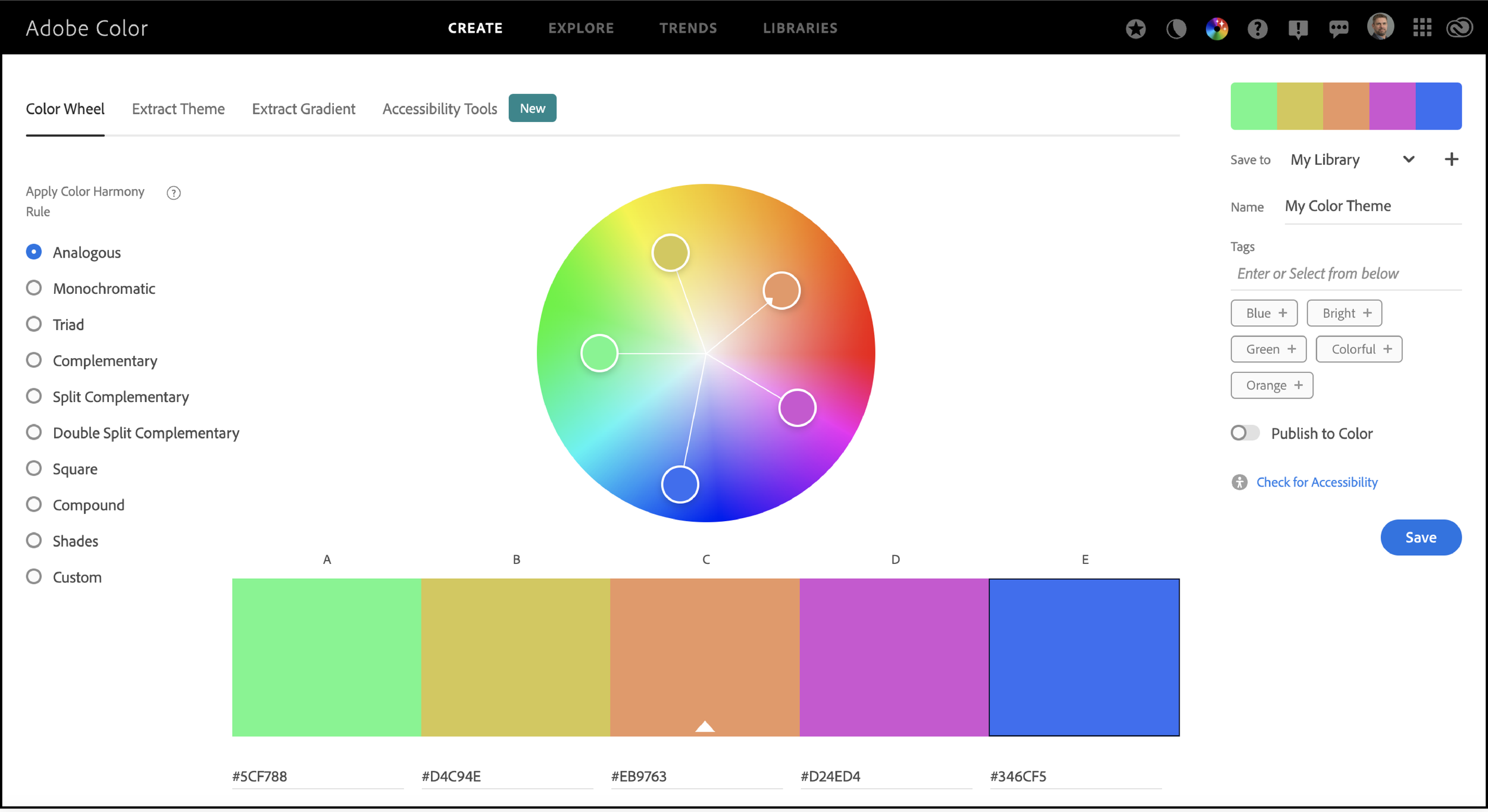
Above: Adobe Color Wheel picking tool.
https://tools.picsart.com/color/palette-generator/tool https://www.pinterest.ca/pin/667940188462705197/

Above: Sample of a brand palette developed for Elvium Life Sciences.
Selecting Your Brand Fonts
You might already have chosen a font that matches your brand’s aesthetic through the creation of your logotype. But the work doesn’t stop there. You will also need a strong secondary font and clear body copy font. Think of all the places where you will need to communicate information in various volumes and formats.
When you start this process, the sheer number of fonts readily available might seem overwhelming. Follow these guidelines to find the typefaces that work best for your brand:
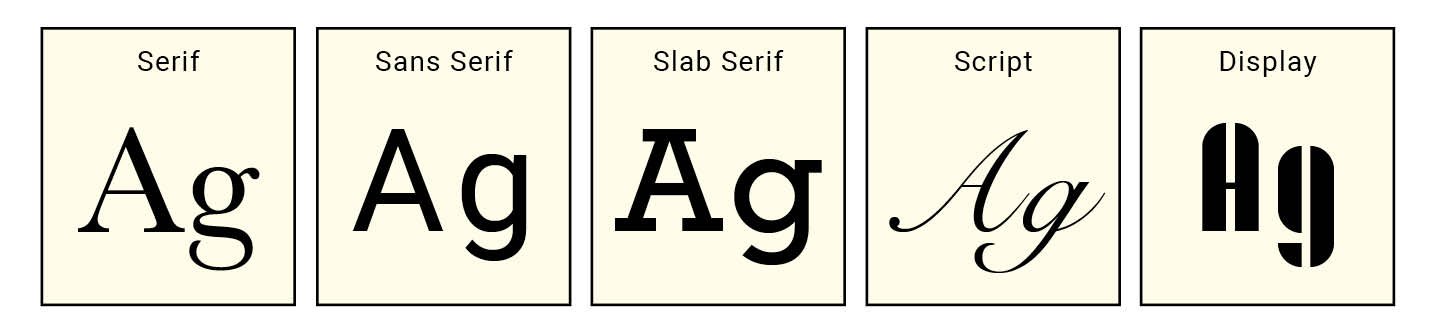
Understand Fonts Categories
Broadly speaking, you have five main categories of fonts, with thousands of fonts within each. These are: Sans Serifs, Serifs, Slab Serif, Script and Display. Crafting successful font combinations and building hierarchy should be your goal.
Mixing Font Styles
You should ensure that when mixing font styles, your aim is to establish and support a clear communication hierarchy. This means the font styles you choose must visually contrast each other. There are different approaches, whereby you can use a single family of fonts and use the variations therein, including styles such as roman (straight) or italics (slanted), condensed or extended; weights – fonts often come in a number of different weights from Extra Bold (sometimes referred to as ‘Black”) to “Extra Thin,” and every weight in between. You can further add styling variations by choosing to use all capital letters in certain circumstance of for specific uses.
You can also pair or mix fonts from different styles, as long as the contrast between them is clear. We do not recommend mixing two sans serifs or two serifs together. It is far better, for instance, to think of pairing a sans serif and a serif family to provide a sufficient contrast.
You should determine specific and consistent styles for your Levels 1, 2 and 3 text and well as for Headlines and Subheads. Your website already will force you to formalize your choices in the form of H1, H2, H3 and P tags that stand for Heading 1, Heading 2 and Heading 3, and Paragraph fonts. So you may as well start thinking about your options ahead of developing your website.
Whichever approach you elect to take, make sure your fonts display a clear hierarchy, so readers can successfully move through the information you want to communicate.
Where to Get Fonts
Do-it-yourselfers might be tempted in the direction of free or open source font, since there are thousands readily available on the internet. Many of them are clean and might serve your brand well. For web use, Google Fonts
https://fonts.google.com/ offers a wide array of free typefaces that you can use on any website, even if it’s for a business. They also have a combination tool where you can see what fonts other people are pairing together.

Above: Google Fonts.
Here is a very short list of additional resources. Some offer various collections of fonts. Bear in mind that many fonts may require you to pay a license.
https://fonts.adobe.com/fonts (subscription-based) https://www.fontshop.com/ (license fee) www.ShareFonts.net (free fonts)
Defining Your Brand Imagery Style
Successful brands use imagery to build a visual narrative that reaches out and resonates with internal and external stakeholders, by perfectly representing their attitude, what they stands for and who they are.
Your choices represent an opportunity to communicate with your audience in a way that is differentiated and recognizable. Whether you opt for a modern or traditional look, colourful or monochromatic, simple or complex, abstract or descriptive, imaginary or factual, calm, cool or edgy, minimalist or lavish, thematically-driven or ad hoc, high-concept versus literal, your choices will help communicate the uniqueness of your brand, help your audience recognize you easily, and show them who you are and why they should trust you.
The Cost of Imagery
Many brands will invest in a few key visuals to be used on primary marketing materials. This may mean custom photography or illustration, which you can own outright, or stock imagery, for which you should opt to purchase rights that grant you a degree of exclusivity, as you do not want a competitor to be using the same image(s) in their brand promotion. While you do not want every image to look the same, they should be visually related so that they are seen as being part of a series. Inform yourself about the difference between Rights Managed and Royalty Free images.
Choosing a style of imagery to represent your brand is a highly subjective matter. So ideally, you have done sufficient research to understand what may or may not appeal to your audience. Do you know what they may respond to positively or negatively? Can you visualize them and what they might want? Can you create or source out visuals that your audience will respond to?
In any case, you should understand your competitors and work to set yourself apart from them in your choices relating to your brand imagery. Afterall, if your competitors and you are all trying to sell a similar product though your branded communication, the key question to ask may not be: “How is my offering different from that of my competition?” but instead “Who exactly is the audience that I am attempting to sell to, and is it distinct from the audience my competitors are addressing?”
Here are links to a partial list of paid and free stock imagery resources
https://stock.adobe.com/ca/ https://www.gettyimages.ca/ https://www.alamy.com/ https://www.pexels.com/ https://www.masterfile.com/ https://unsplash.com/ https://www.shutterstock.com/ https://www.istockphoto.com/

Above: Sample of a brand imagery palette developed from various stock photography resources.

Above: Sample of a brand imagery palette using custom photography.
BEYOND THE BRAND VISUAL STYLE
Your brand visual style is also about how your ideas and designs merge to create your brand “space”. The depth and extent of the brand style development depends upon the anticipated marketing communication requirements of your business, the overall scope and size of your operations, its set of issues and opportunities, and the time and budget available to develop an appropriately dimensional brand space. In the next article, we will explore the development of various brand communication tools, as well as the codification of your brand’s visual style into a brand identity guidelines document.